

NapTapGo IS A PAN INDIA, NEW AGE AFFORDABLE LUXURY POD HOTEL CHAIN THAT PROVIDES UNIQUE STATE-OF-THE-ART TECHNOLOGY CAPSULE ACCOMODATION EXPERIENCE FOR ALL THE MODERN VOYAGERS


With its first hotel in Noida, NapTapGo is beginning an ambitious journey to diversify its presence across the spectrum of the hotel industry, catering to transient guests, business travellers, and tourists. Over the next five years, the hotel brand aims to transform the concept of affordable luxury through innovative Al-powered services, catering to the expanding domestic and international tourism in the country. [As forecasted by the IBEF (Indian Brand Equity Foundation), the Indian travel sector is anticipated to soar to a valuation of US$125 billion by FY27.]
The origins of the capsule pod culture trace back to its inception in Osaka, Japan, during the late 1970s. Since then, it has evolved into a global phenomenon, symbolising compact, efficient, and futuristic accommodation.The strategy created by the team for NapTanGo concurrently incorporates minimalism and the character of the technological era that lies ahead, all the while prioritising robust brand recall.
Derived from the three fundamental actions of rest, refreshment, and readiness, the visual identity for the brand was created based on these aspects keeping in mind the modern minimalism factor which forms the basis of whole conceptualisation.
Cosy Nap —— Fresh Tap —— Ready to go


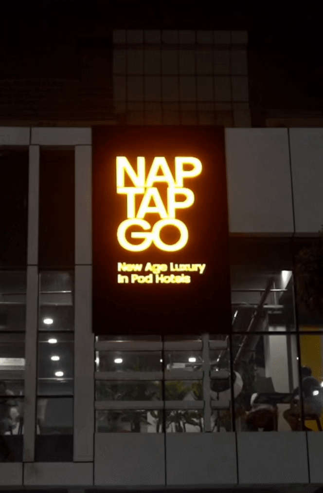
In minimalist branding, where every element is carefully chosen for its impact, the color choice of Spectra Yellow brought a sense of dynamism and modernity, making it the ideal choice to infuse the brand with a fresh and lively identity while adhering to the principles of simplicity and sophistication.
This distinctive Pantone color, emerged as a powerful and vibrant characterized by its bright and energetic demeanor, adding a touch of warmth and optimism to minimalist designs. Spectra Yellow also effortlessly complements the clean lines of the visual language and simplicity inherent in concep'ts minimalism, creating a visually striking contrast that captures attention without overwhelming the senses.


Brand: NapTapGo
Industry: Hospitality
Type: POD Hotels
Parent Company: Skypocket
Origin: Noida, IN
Launch Year: 2023
Agency: medea
Object Sans is a contemporary type family that puts together the best qualities of Swiss neo-grotesque and geometric fonts. It’s a multifunctional workhorse designed to work best in → any printed and on-screen contexts, including logo design, brand identities, websites, packaging, posters and headlines; regular weight is carefully tuned for small-sized body text.
Brand Identity System
Visual Identity
Conceptualisation
Marketing Print Collaterals
Interface Design [UI]
Illustrations/ Pictograms


The whole identity system is based on three geometric forms -Squares and rectangles which represent tangible, fabricated forms and curves represent intuition and inspiration. Circles also known as Ensō in Japanese, represent enlightenment, perfection, strength and elegance.

The semicircular shape, representing "nap," embodies the state of relaxation during sleep, evoking the posture of lying down and resembling a rocking chair that gently lulls one to sleep—a metaphorical representation of 'curves.' In Japanese minimalism, curves symbolize intuition and inspiration. The circular symbol for "go" is reminiscent of a wheel, symbolizing a cheerful farewell for departing guests, drawing inspiration from the minimalist philosophy that seeks a seamless and compact destination experience.